Responsive+Mobile Website
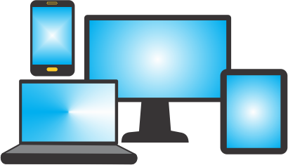
Smartphones and handheld gadgets have revolutionized the way you browse the web. A vast majority of users now use their phones to find products, read reviews and shop online. When the user is on the go, they don't want to wait to get home on their desktop for looking into the information they want. Instead, they use their mobile phones to stay connected to the world and find the service they need in minutes rather than hours.
A large number of businesses lose a lot of customers because their website is not responsive as per the user's device. In order to stay in the limelight and ensure maximum user experience, you need to have a mobile responsive design that caters to every customer's needs and is equally functional and accessible via desktop PCs and handheld devices. And that's why a responsive website should be your first choice.
How Can we Make Responsive Web Design For Your Business
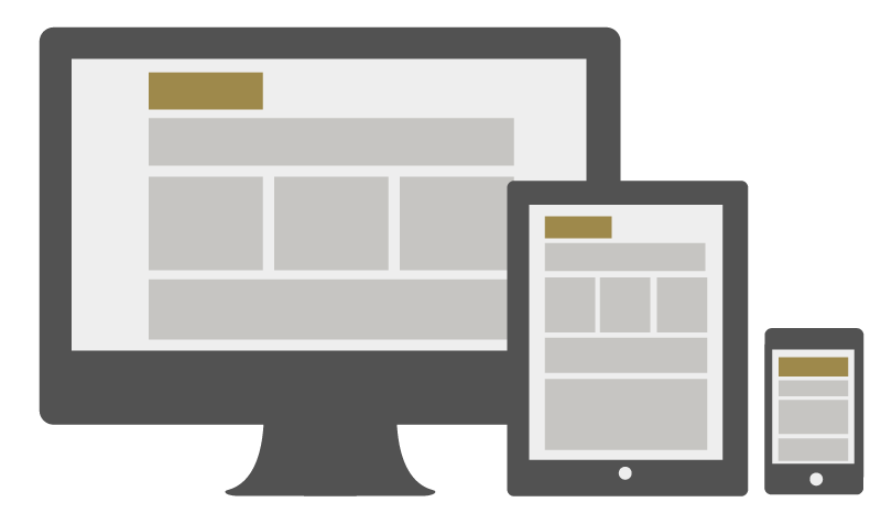
A lot of people, especially small businesses, are wary of investing in a separate mobile website. Having a mobile responsive design is the best choice in such scenario as it adjusts automatically on any smart device and mobile phone and you don't need to get a separate website designed for mobile use.At Refresh Ideas, our web design experts leave no stone unturned in designing a user-friendly, comprehensive and visually appealing responsive website for you.
Here's how a responsive website design can help your business.
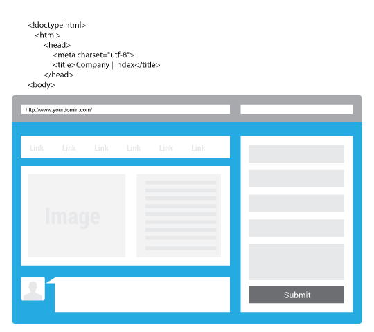
There's a good chance that you already know it is crucial that your business have an online presence. A good website can make a world of difference in gaining new clients, keeping the old, and bringing in additional sales. But it's not just any old website that is going to do this — there is a lot more that goes into it. Those who haphazardly throw up a website may be disappointed. Take, for example, Responsive Web Design and what it can do for your business.
A smooth experience-
Responsive Web Design creates a smooth experience for those who visit your site. The flexible design will automatically change layouts to meet their needs, allowing for easy surfing of your site. Even those on smartphones will find that your site offers simple navigation when created using Responsive Web Design. Your website visitors aren't going to turn into customers if they can't read and navigate your website.
Access for all
The last thing you want to do is create a site that is essentially off limits to people who are using smartphones or other particular devices. Responsive Web Design will automatically adapt to whatever device they use to access your site, as well as all screen sizes.
ASave time and money-
Millions of companies today are creating multiple sites so that they are prepared for those who log on with their smartphones, tablets, and other devices. When you use Responsive Web Design you do not need to create and maintain multiple sites because the one site will automatically adapt to the method in which it is being accessed.
Happy Clients
Years in Business
Running Softwares
Running Portals
Copyright © 2017. All Rights Reserved.